DataWISE not Data-Foolish
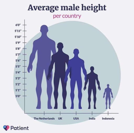
Wendy Johnson points at a graph (see below) depicting the average height of human males around the world. Johnson, an NCSE Science Education Specialist, can hardly contain her astonishment at the visual discrepancy between the figure of the Dutchman at 6’0” tall and the Indonesian man at 5’2” tall. The teachers she shares it with find it almost comical. But students could be fooled into thinking that Indonesian people are unusually small by the poorly designed scale for the graph’s Y-axis and disproportionate graphical representation of the male figures.
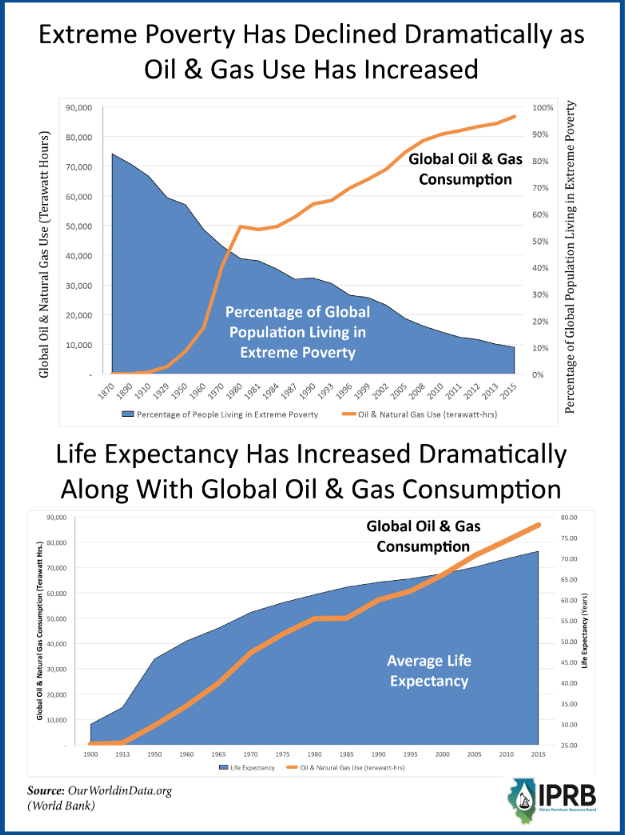
More insidious is an example she shares from the Illinois Petroleum Resources Board (below, right) that suggests that increased life expectancy and decreased poverty are the direct results of increasing global oil and gas consumption.
These kinds of graphs can be hard for adults to analyze with a critical eye. For young people, bombarded by information that they often accept or reject in the blink of an eye, it can be nearly impossible.
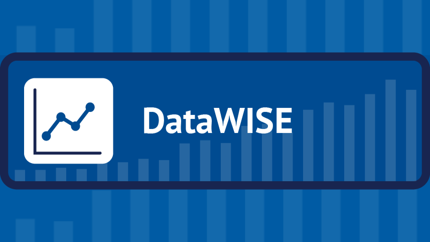
To help students become more information literate when confronting data representations like these, NCSE has launched a set of resources under the rubric DataWISE. Given a claim presented with accompanying data, students use the DataWISE tool to ask themselves a series of questions to judge the source, pur- pose, presentation, and cogency of the claim and evidence. They start with questions that allow them to determine whether the claim is Worthy of their attention, then Inspect the data, ask whether the interpretation of the data and the conclusions make Sense, and finally pay close attention to the Emotions elicited by the claim and data presented.
DataWISE is used in several of NCSE's new Story Shorts (modular standards-aligned curricular units). In addition, the DataWISE resource on the NCSE website also includes a few standalone activities that teachers have found helpful.
According to the National Academies of Science, Engineering, and Medicine, the world is facing an “explosion of misinformation and disinformation that has weakened public deliberation and undermined the public’s confidence in science.” Teachers are increasingly being called upon to help students decipher fact from fiction in an unbiased and non-political fashion in the classroom. The DataWISE tool is NCSE’s answer to that need.
NCSE has already led several workshops in Michigan, Colorado, Alabama, and North Dakota, where teachers actively explored the DataWISE tool and associated activities. The response has been overwhelmingly positive.
This comes as no surprise to Johnson, a former high school science teacher. She knows firsthand the emphasis placed on graphs and graphing in the science classroom. Yet she also knows that graphing is usually taught as a skill using broad brushstrokes, almost always divorced from critical media analysis. “DataWISE really just slows you down and makes the steps of analysis really clear to students,” Johnson explains.
Providing this kind of tool to teachers and, by extension, their students makes great sense given NCSE’s sustained efforts over the past several years to shine a light on evolution and climate change misinformation, disinformation, and misconceptions. Graphs and infographics, like the one from the Illinois Petroleum Resources Board, can easily be used to mislead, obfuscate, and confuse. Science teachers, Johnson says, are more likely to tackle misconceptions with their students if they can tie them into existing curriculum. Graphs and graphing provide a perfect medium.
This has been borne out during the NCSE-led workshops for teachers. “I have learned so much that can be applied to my class and my curriculum,” remarked one teacher who attended a workshop led by Johnson in North Dakota. Another said, “Bias in data presentation is part of my curriculum so this session was very helpful.”
More science specific
For the past few years, NCSE has been using other media literacy tools to help students critically analyze information, many of which have colorful acronyms. For example, one developed by librarians at Chico State University in California is called the CRAAP (Currency, Relevance, Authority, Accuracy, and Purpose) Test and is used to check the reliability of sources. FABLE (Find, Analyze, Bias, Look, and Exert) is another that focuses on logical fallacies. Though helpful, these tools tend to focus on media literacy—the reliability and trustworthiness of online sources, for instance—but don’t always get to the heart of inquiry-based scientific practice, namely, closely examining data and determining whether the data can support whatever claim is being made. Hence the NCSE Supporting Teachers team came up with DataWISE, which like the CRAAP Test and FABLE allows students to analyze the origin of information, but also prompts them to analyze the information itself.
“DataWISE is one way to help students internalize the question they should always be asking of themselves in science, and that is: ‘Does the evidence support the claim?’” Johnson explains.
Using this tool and attaining information literacy is critical for students as they grapple with their understanding of the nature of science. Typically, science teachers focus on the “I” (Inspect) and the “S” (does it make Sense) in DataWISE. However, the “Worthiness” of a claim is critical in this age of social media-driven news and information, while the “Emotions” piece is often overlooked but can blind both the conveyor and recipient of data to biases that affect interpretation.
The pandemic and trust in science
Of course, in the not-so-distant past, we vividly felt the need to be able to interpret scientific data presented in all kinds of graphical ways. During the COVID-19 pan- demic, the public was bombarded with the latest science updates and health information, often in the form of charts, infographics, and tables.
“The World Health Organization says that an infodemic accompanied the COVID-19 pandemic,” Johnson notes. “There was so much information, including false and misleading information, that people didn’t know what to believe, and some gave up trying to make sense of it all because they were overwhelmed. And, of course, that is not what we want as science educators.” In the meantime, the NCSE Supporting Teachers team continues to work with teachers to help them figure out how best to integrate the important DataWISE tool into their curriculum. And as teachers use the tool more, they’ve begun to provide feedback on where it fits best for them, how they are employing it, and how they’re tailoring it to fit their needs.
NCSE has purposely developed the DataWISE tool to be flexible and adaptable. In a rapidly changing, information- and misinformation-dense world, the hope is that DataWISE will keep teachers one step ahead.